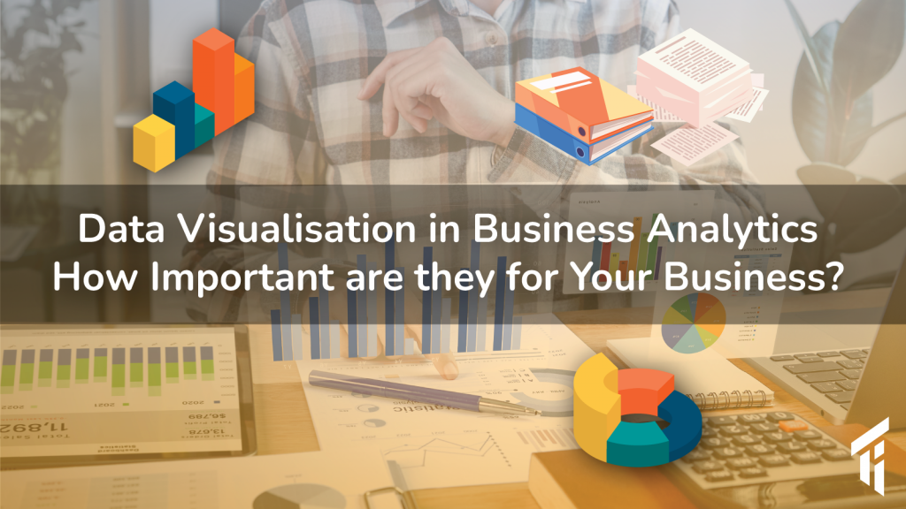
Data is the new king. In all its bits and pieces, data make valuable information that all businesses need today. Be it your own, or the customers, data needs to be collected, analysed and presented for making “informed decisions”. Since it needs to be understood and communicated, visualising data in business analytics is a complex process made simple, just like storytelling.
90% of data ever created in the history of the world happened in recent two years. And this is only going to increase exponentially in the future. Businesses have always been taking advantage of data. So, if anyone is making more profit from them, then it is business. Thus, it is high time businesses start thinking of big data, analytics and the possible related stories that can be visualized using data.
What is data visualisation for business?
Yes, data visualisation is storytelling indeed. The more the data collected, the more precise and authentic the story becomes. And it should be able to deliver a strong message.
Data was once expensive and difficult to be found. But with the era of digitalisation, data became abundant, cheap and very difficult to process. It is now, almost like searching for a needle in the haystack, if used with conventional methods like excel sheets. Here is where the concept of big data and artificial intelligence arises.
The credible amount of information became so vast. To store, channel and analyse this vastly generated data, traditional software solutions are insufficient. To process these data, data scientists are pushing the limits day by day. The collective efforts of data analysts, be it in the field of science or management, contributed much to modern business analytics and related software usage.
Data visualisation comes into play where big data analysis needs to be taken out for understanding. For common people to understand bid data, Data visualisation is the only way.
It is the process of taking raw data, and transforming them into graphs, charts, images and videos that explain the numbers in visual form. The magic is the short amount of time it takes to reach an intuitive decision. We can discover new trends, that were undiscoverable in a raw heap of data. Data visualisation in business provides clear and actionable insights into their business process. Thus, it almost automates the business processes.
Modern business management software with Business Intelligence
If you are still using a spreadsheet (by the way, they are brilliant tools to date) for business management, not only you, but your whole organisation must be exceptionally intelligent.
Otherwise, it is high time to explore new software tools.
Terabytes of data sitting in a data centre unused is a burden. It should be put to use to be valuable.
For that, in the current era, big data is often combined with machine learning. When these technologies are used in business, it is called business intelligence or (BI).
Data visualization tools for businesses
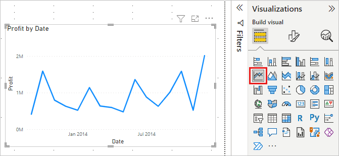
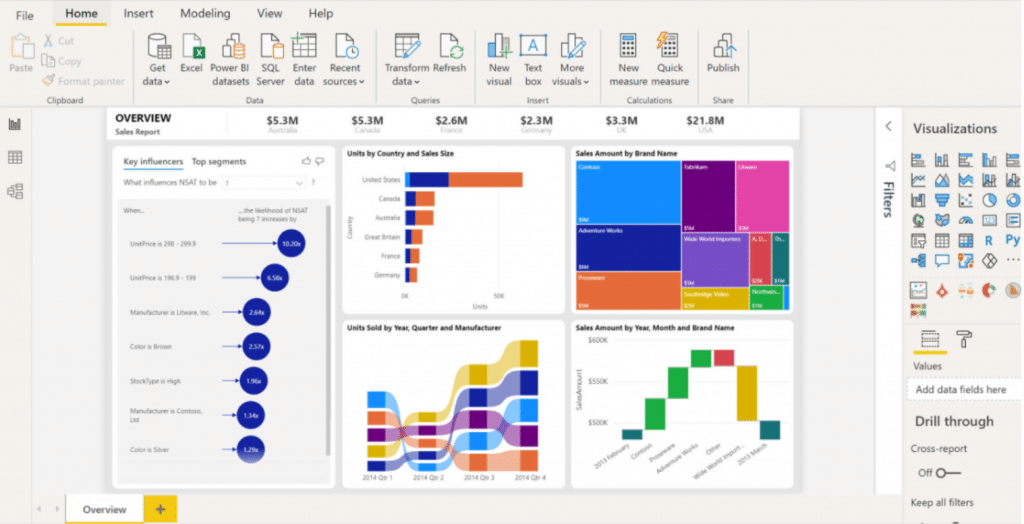
There are several BI tools available today. We can use independent tools that are specially designed for big data analysis and data visualisation. Microsoft Power BI, Analytics and Tableau are some of the popular BI tools. Cross-platform support and being open-source make them exceptionally handy and cheap.
Independent tools are available to integrate with the existing CRM or ERP that businesses are using. Tech giants who offer these facilities offer their business intelligence integrations.
What makes these tools stand out is the incorporation of complex data analytics tools with interactive visualisation tools.
Ways we interact with data
Data can be represented multidimensionally- from simple line graphs to interactive 3D designs. On the level of complexity, let’s list them as,
Data can be represented multidimensionally- from simple line graphs to interactive 3D designs. On the level of complexity, let’s list them as,
- Simple graphics – Line graphics or histograms. Representing data between two-axis and referencing one or more attributes, if needed.
- Using presentation – images, or video, rendered from a data analysis software. Usually, an image or video output is printed or played.
- Creating interactive data visuals – There are some software tools which can take our data file as an import and visualise the outcome in a way we want through an interactive surface.
Here are some examples of beautiful interactive designs shared on the Tableau website:
- Real-time data visualisation: As the computing systems are getting faster with technologies like cloud and SaaS (Software as a service, which runs on cloud servers), real-time data visualisation has become very handy and cheap. Not only in real-time, but given a depth of timeline, some data serve a better purpose.
For example, real-time and timeline-oriented view on customers visiting a shop, over some time can be analysed. Sometimes a fast-moving timeline can be more intuitive than a picture on a 2D surface.
- Dashboards– Finally, dashboards are a unique interface which includes the data in different areas and displays each of them in ‘cards’ up to each user’s convenience. In businesses, dashboards become powerful real-time tools to analyse and visualise data at the same time.
For example, in SAP Business One dashboard (often called as cockpit) can be customized with essential cards. From the vast amount of business data already available, cards selectively present a glimpse of the most important data to the managers. Since each card display data in visuals, this is a compact form of real-time business data visualisation.
Conventional patterns
Although data can be presented in vast and exquisite means, there shouldn’t be any conventional deviations. For example, hot temperature/urgency is represented in the red end of the spectrum while blue is its opposite end value. In the same way, in a graph, the timeline is always represented horizontally. If this representation changes, the data becomes more difficult to be perceived.
Persuasive data visualization
Just like conventional settings for data visualization, some persuasive appeal is to be applied from the design perspective.
- Human eyes move rapidly over an image to collect data faster. The rapid eye movement of humans picks up certain parts of an image. It goes quickly between static and interactive parts in a visual.
- Pre-attentive attributes- colour, contrast and shape of the visuals against its background play a role. For example, we need to display data in a colour range against a contrasting background colour.
- When it comes to displaying text, keep in mind alignments and a visual path.
- Patterns- Similar patterns help to pick up subtle differences and are good for representing quantity. For example, if we mix data of different types with circles and rectangles, it might be hard for the eyes to pick up. Instead, give distinct colours.
- Create interactivity- The only way users interact with digital data is through a touch-screen, mouse and keyboards. Gestures like a tap, slide, hover, click, speed of mouse movement etc. can be used to highlight and display the right data needed by the users.
If these points are put to use, it will be the eyes, instead of our brain, doing half of the work in conceiving data. Our brain recognizes patterns, and in patterns, we find connections.
Data Visualisation methods
Standard data visualization is available in most office suits like word, excel etc. They are traditionally used and are easy to be incorporated anywhere. Even big data can be visualized in one of these simple methods of display.
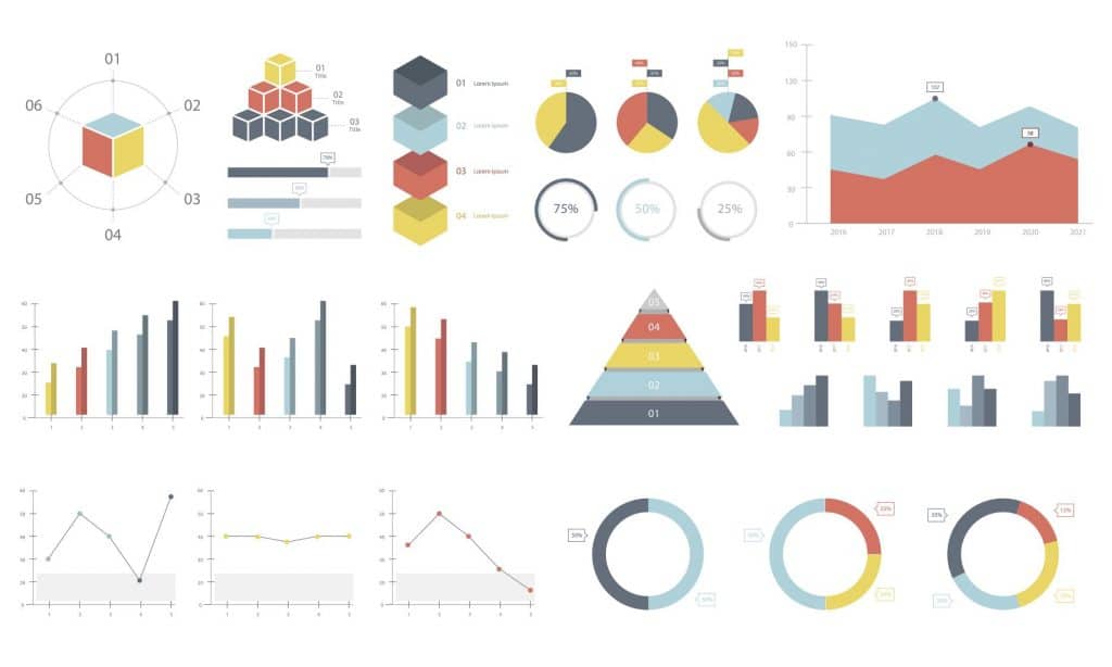
Verity of different graphs is given standard names traditionally to understand and represent data. These are methods of representing data. Some are:
Graph (or charts): They are simply good for visualising the time and series relations. Whether you are looking for profits earned over a while, or progress of sales, this method still serves good purposes within its simplicity.
Pie charts and pyramids: They are good for displaying data in percentages. This is traditionally a great way of displaying something scarce. For example, storage space, commodities by size etc.
Histogram: unlike a simple graph which shows frequency. It represents a range of values instead of plotted data points.
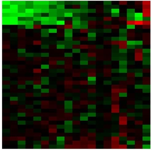
Heat map: heat map visualisation is based on numerical values represented in grids. It is usually colour coded from high to low-value points accordingly. A higher-resolution heat map ends up in creating insightful information. For example, data collected on mouse movement in a website can be used to produce a heatmap of that website.
Benefits of data visualization in business reports
You can’t always connect your data if you look at the numbers alone. But data vis unlocks more insights and discoveries from the collected data. For businesses, these insights are more valuable since it makes a predictable and sustainable
- Financial reports: Reports that can be easily put to visuals so that we can find the patterns and trends more clearly. With less attention.
- Dashboards: dashboards, when customized and arranged, speaks a lot and serve the user in higher ranks. For example, a manager can fetch real time data every morning on his team’s performance and company’s performance in general. With data visualisation, anyone can see the analytics.
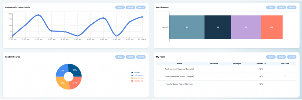
A dashboard from Vryno CRM
- Marketing and sales: Engagement trends: easy-to-read data visualisation is great to make any boss happy. As you continue to check data from your CRM, the most common trends will emerge. Use that info to create customer journeys that will help your strategies to move forward.
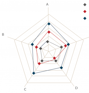
- Human resources- learning management reports and talents on team measured in spider diagrams like these
- Project management: visual data used in project management easily spot the gaps and hurdles faced by a project
How to set up business data for analytics?
A widely popular ‘fact’ nowadays says that the average human attention span is 8s and it is lesser than a goldfish. The numerical jargon will not appeal to human perception nowadays. For everyone’s understandability, we can make use of modern data tools to present our valuable data as visuals.
As a business, you might be using either a CRM or ERP software or combined, or even, some popular software like Odoo or SAP Business One ERP which incorporates all of these elements appropriate for your business. As much as these modern software solutions provide the artificial intelligence tools to compete with modern data trends for the business, such could be the representation so that it can be viewed and used by every stakeholder.
How do we help?
When it comes to business, it is not easy either to upgrade to the so-called modern software trends. But today’s mainstream business software companies provide numerous practical solutions in easy and fast ways. This is what we exactly mean by empowering businesses in a technologically agnostic way.
We at target integration have evolved over a decade with handling business data and its usage with modern software technologies. Our experts keep close track of the new trends in the software world and advice, on the most feasible solution for your business’s specific needs in integrating new solutions.
If you are thinking of implementing business intelligence tools in your current software and working your way with efficient data analysis for the business, leave us a message.
Watch our webinar on How to enhance SAP Business One data with Power BI